Stop searching and start watching.
A self-directed redesign study of Netflix's web and mobile apps. I designed organization tools that let people build their own libraries instead of losing the first 90 seconds of every session to an ever-shifting home screen.

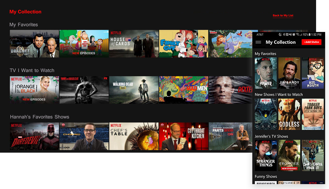
As a design exercise I evaluated Netflix's web and mobile platforms to see whether a few key aspects could be improved. User interviews, company research, competitor analysis, and heuristic evaluation surfaced the design problems; pen and paper, Photoshop, and Figma turned the solutions into an interactive prototype I then presented.
Goals
Responsibilities
Improving a design people already love.
Company research, user interviews, heuristic evaluation, and reading through blogs and message boards for candid customer sentiment. The through-line: people want more control over how their shows and movies are organized, and they're frustrated by the algorithm and the ever-changing home screen. For Netflix, data is king: nothing ships without it.
{{ s.label }}
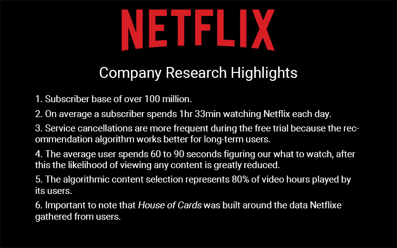
People spend the first 60–90 seconds deciding what to watch, and if they don't land on something, they leave. What if they could organize their shows and movies around their mood, their time, and their favorite genres?
Sketching a way to organize.
When designing a playlist-like function, I looked to apps like Spotify for inspiration, and to how people organize their entertainment in real life. My own family once cataloged our VHS tapes and DVDs, and that memory shaped a lot of it.
After feedback on each round I iterated until the flows felt right enough to take into a high-fidelity prototype.
Collections, Shelves, and Schedules.
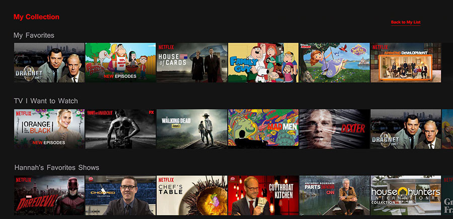
Since I was adding to the interface rather than rebuilding it, I composited real Netflix screens in Photoshop and wired them up in Figma. Three features anchored the redesign.
{{ f.desc }}
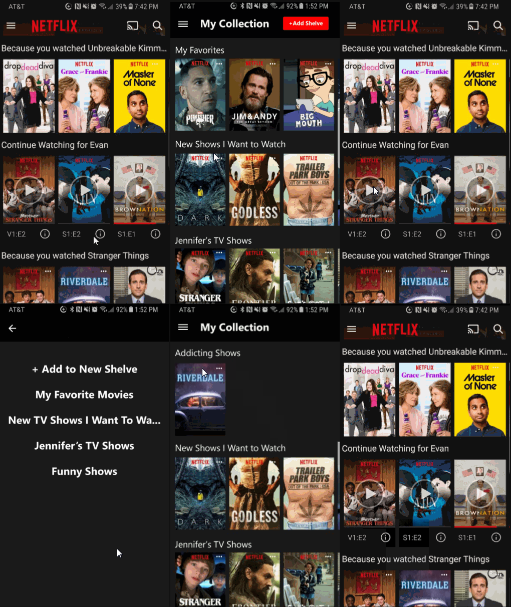
Onboarding, home, and scheduling.
What it taught me.
This redesign taught me how much good research shapes good design. The company research was what made the insights usable. I'd have liked more time to user-test for further iterations, but within the constraints the final prototype came together well.
Presenting to my instructor and peers brought some great feedback, like using a flexible "time bucket" instead of rigid schedules. I'd want to work that into a next pass.
And about a year later, Netflix shipped a redesign with some of this same functionality: separate Movies and TV pages that finally split out your list.
Back to all work