Making Gmail’s hidden tools easier to find.
A research-led redesign of Gmail's desktop inbox that I worked on with two other HCI grad students. We focused on surfacing the powerful tools people never discover and making common controls easy to find and understand.

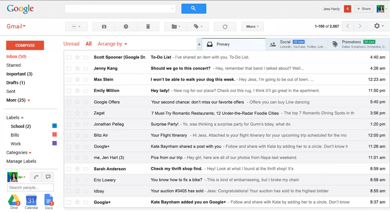
Working with two other HCI graduate students, we set out to evaluate and improve Gmail's desktop inbox. Research, interviews, heuristic evaluation, and moderated user testing formed the basis for the redesign, which we presented for feedback from a senior UX consultant and our instructor.
Goals
Responsibilities
Understanding how people really use email.
{{ r.desc }}
Gmail's desktop inbox was badly underused and its basic functions were ambiguous. Across every experience level, users were surprised to learn about useful tools they'd never touched, like labels and inbox configuration.
We put the current inbox to the test.
Participants completed tasks built from the issues that kept recurring in interviews.
task failure rate on even the most basic assignments, which confirmed what we'd heard in interviews.
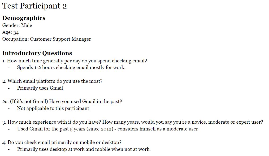
Three problem pages, one focus.
We sketched solutions for the three pages that tested worst (the inbox, the opened email, and settings), then focused the prototype on the inbox, where the biggest wins were.
Common controls, made visible.
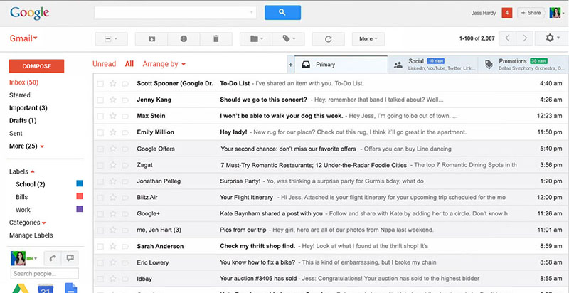
We built a static mockup of the redesigned inbox with one aim: make common controls easier to separate and understand. We made four main changes.
“You took an already established design and improved on things I hadn't thought about.”
— our instructor, on the final presentation
What it taught me.
This project was heavier on research than on the redesign itself. Taking on a mature design from a company with Google's resources, then genuinely improving it, was difficult but rewarding. With more time we'd have prototyped more of the interface, like settings and the email toolbar.
Google redesigned Gmail about a year later with new features, but didn't address the issues our design set out to fix. That made the case for our findings all the stronger.
Back to all work