Moving GasBuddy’s dining rewards from cash back to points.
I redesigned GasBuddy's dining rewards, taking them from a flat cash-back percentage to a points-per-dollar model, and rebuilt the restaurant detail screen around the information people use to decide where to eat: hours, distance, photos, and reviews.
GasBuddy's dining offers used to work like the fuel side of the app: link a card, get a flat cash-back percentage at participating restaurants. Product wanted to move dining onto a points-per-dollar model to drive more engagement. My job was the redesign: the new earning model, the card-link states, and a much richer restaurant detail screen to go with it.
What it used to look like
Two screens carried the whole feature: a list where every restaurant paid the same, and an offer screen that was mostly fine print.
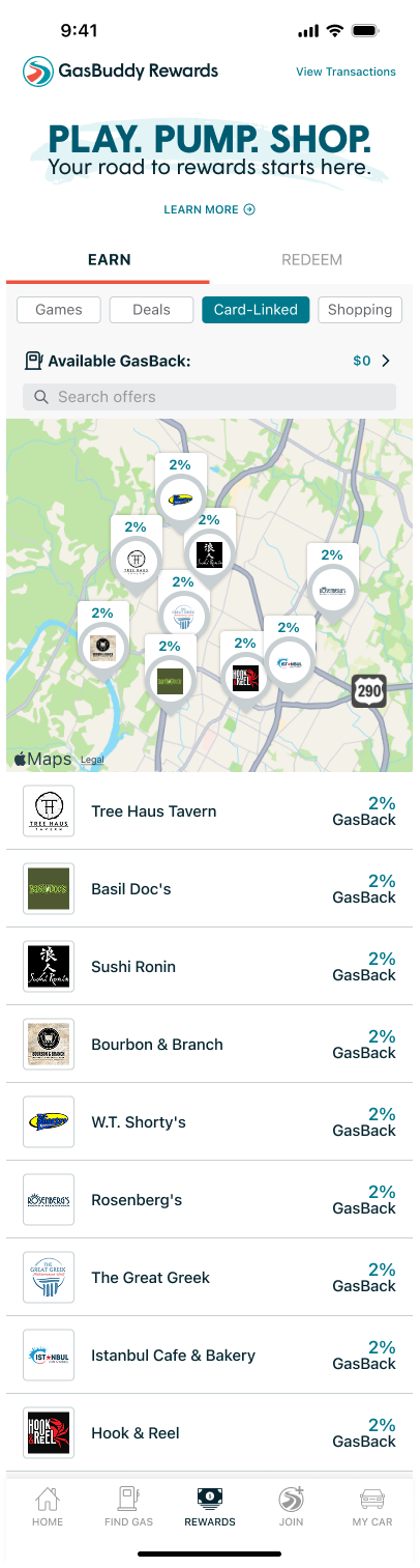
Every restaurant showed the same flat 2% GasBack. Nothing to compare, no reason to pick one place over another.
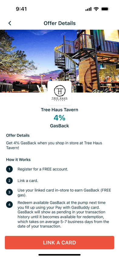
A flat percentage, a three-step explainer, and a redeem button. Nothing about the restaurant itself.
A points model, and a screen that helps you decide.
The redesign moves dining onto points per dollar and rebuilds the restaurant screen around the questions people ask before they eat: is it any good, is it open, how far away is it, and what does the food look like.
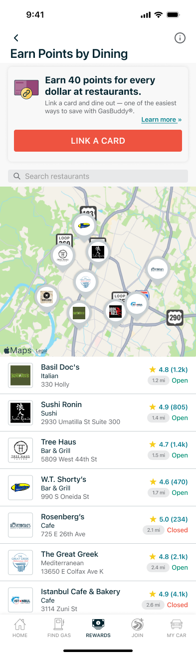
Instead of a wall of identical 2% badges, the list now leads with a points offer at the top of the screen and gives every restaurant a star rating, review count, distance, and a live open/closed label. You can make a decision right from the list.
Design with a purpose.
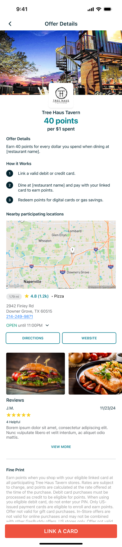
One offer screen, every card state.
{{ currentDesc }}
Each state points to one clear next step (link a card, start earning, or re-link) and uses the same banner slot at the top of the screen, so the layout never shifts.
Shipped and live in the GasBuddy app. Engagement data on the switch to points is still being gathered, so I don't have numbers to share yet.
Back to all work