Redesigning the City of Dallas utilities payment portal.
During my internship with the City of Dallas, I redesigned the ePay utilities portal from the ground up: reorganizing dense, inconsistent pages so they're easy to scan, bringing the design in line with the city's brand, and adding a mobile version so residents can finally pay a bill from their phone.
As part of my internship with the City of Dallas innovation team, I was asked to evaluate and redesign the city's utilities payment portal. Quarantine limited access to research materials and real users, so I leaned on established usability principles and benchmarked other cities' payment portals to ground the redesign.
Goals
Responsibilities
What I was starting from.
The live portal buried common tasks under walls of small text, and a left-rail menu split related actions across many separate pages. None of it worked on a phone.
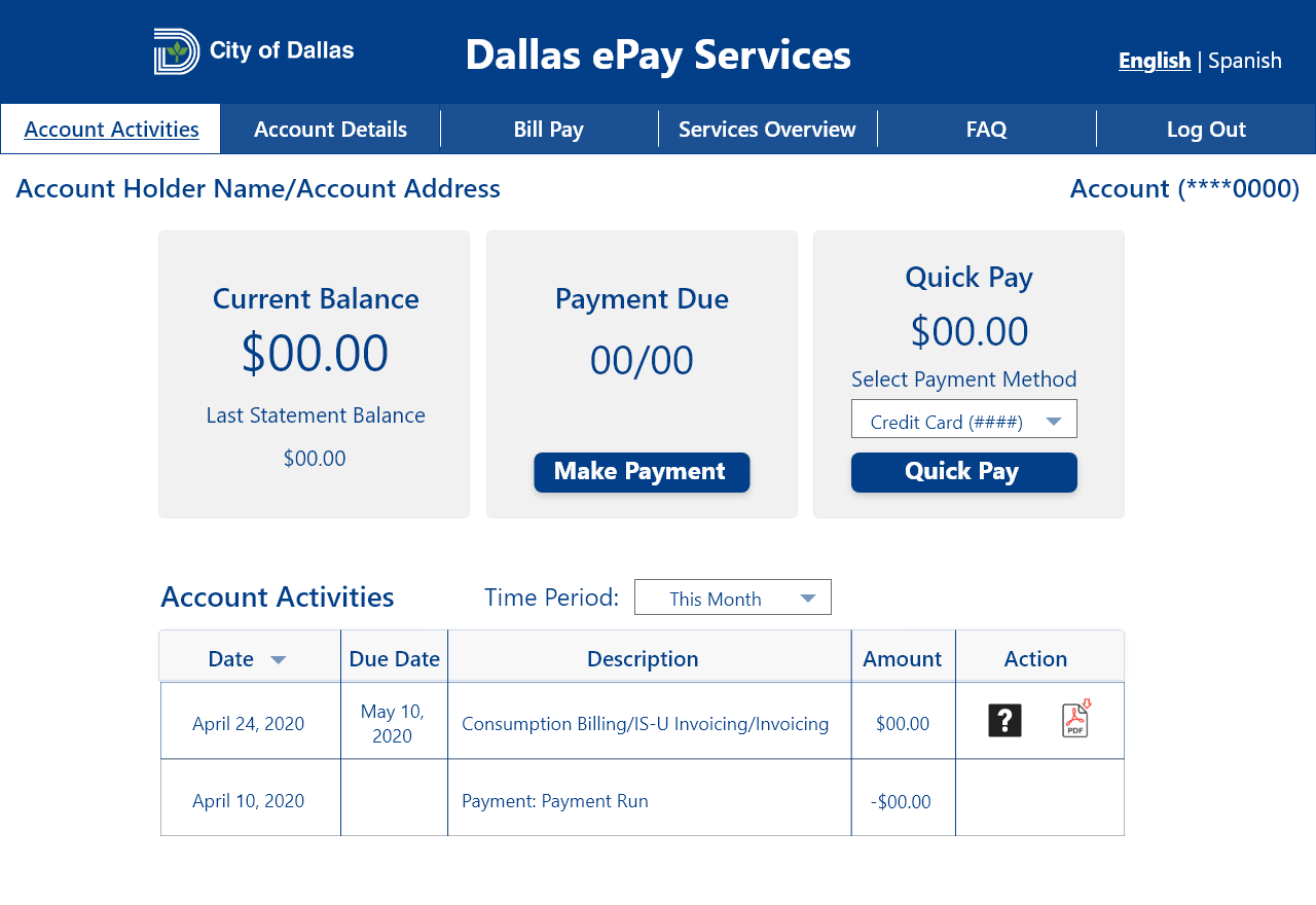
Account Activities, before and after.
This page carried most of the redesign: balance and quick pay up top, a clean transaction table, and navigation that finally matches how residents think.
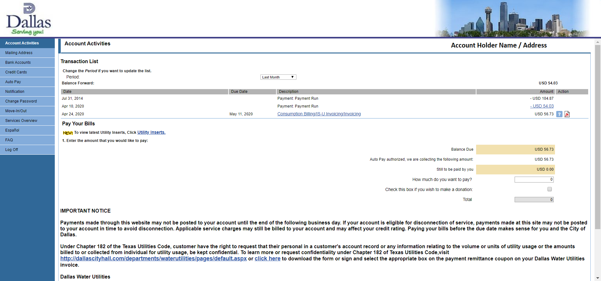
What the audit turned up.
With no requirements or documentation to work from, I evaluated the whole site myself, focusing on its organization, its consistency, and how well it matched the mental model of someone who just wants to pay a bill.
Nothing tied the portal back to the city's other websites. Every page had a different look, logo, and layout.
The information architecture made it hard to find relevant content efficiently; related actions were scattered across separate pages.
Small font sizes and large unbroken blocks of text hurt both legibility and readability.
With no way to pay from a phone, the site ignored how most residents actually prefer to make a payment.
Reorganize content so residents can scan for what they need, bring the design in line with the city's branding and homepage, and build a mobile version that lets people finish a payment from their phone.
Regrouping the content, page by page.
Examining the content surfaced themes I could group together to cut noise and give the site real navigation.
Split the login page into four clear sections (login, sign-up, new service, and help) so each goal is immediately scannable. On registration, I dropped redundant instructions, separated login from account details, and added an example of where to find an account number.
Removed the confusing tabbed structure and reorganized topics so main headings can be scanned and expanded to reveal specifics.
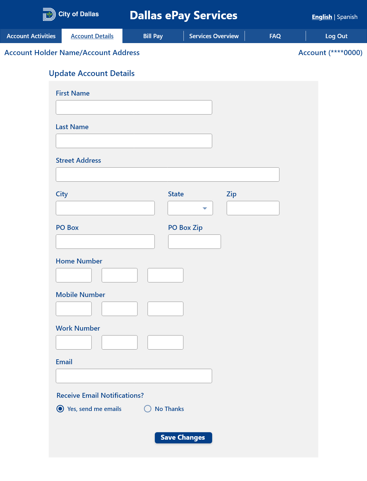
Moved the vertical left rail to top navigation and consolidated pages: "Bank Accounts," "Credit Cards," and "Auto Pay" became one Bill Pay; "Mailing Address," "Notification," "Change Password," and "Move-in/out" became Account Details.
The final desktop mockups.
The final mockups keep functionality intact while adopting the city homepage's navy-and-white identity, a consistent grid, and roomier type. Built in Adobe XD.
A phone-first path to paying a bill.
The new responsive layout mirrors the desktop structure and, for the first time, lets residents log in, register, and complete a payment entirely from their phone.
This was a tight timeline with limited access to research and real users, but it's the project where I moved from web and database work into human-centered design, and it set the direction for everything I've designed since.
Back to all work