E logo

Popped Politics (Summer 2019)

Burst from your political bubble.

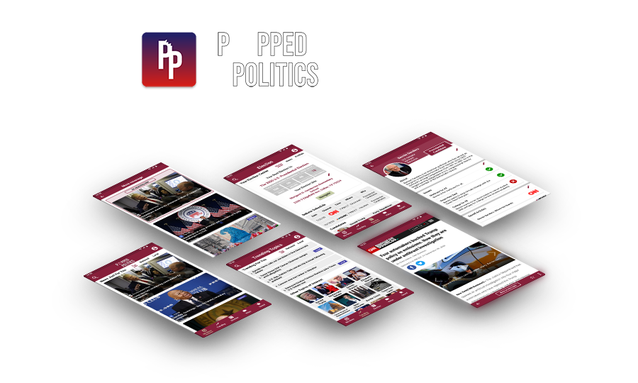
Popped Politics final images

Overview

  • Me and a friend, a senior product analyst for a mobile app company, decided to design a political app.
  • Overall, the design took around 2.5 weeks.
  • We used market and competitor analysis, as well as user interviews, to help identify specific pain-points which would become the basis for our design.

Goals

  • Decrease the amount of misleading articles read by people looking for their news online.
  • Increase political engagement in people age 18-44.

Responsibilities

  • Research
  • User Interviews
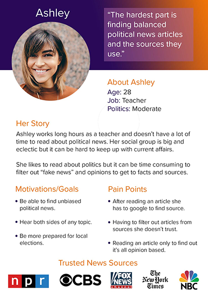
  • User Personas
  • Branding
  • Wireframing
  • Prototyping
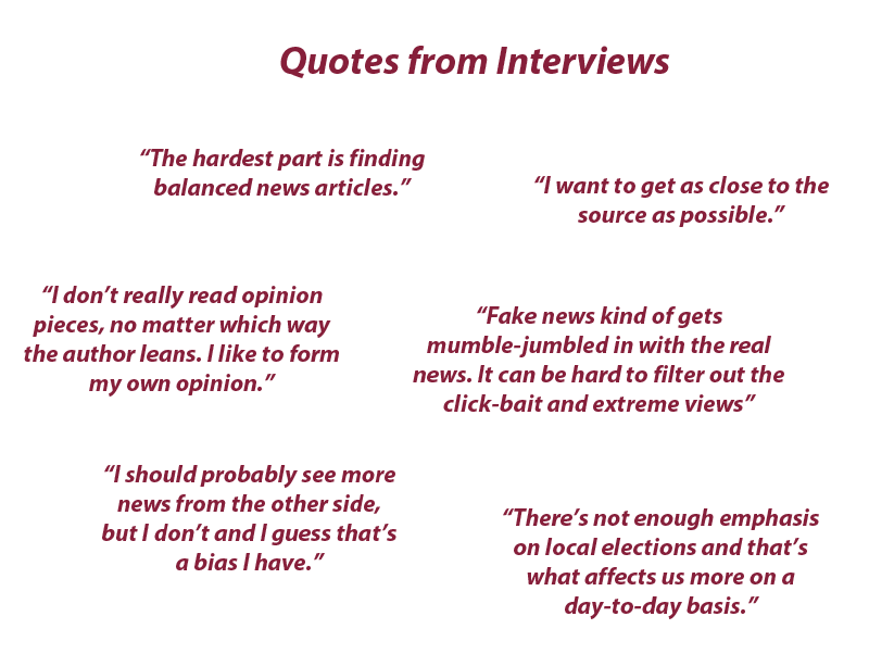
Popped Politics user quotes

Research

User Interviews

We did interviews with 4 prospective users whose political leanings ranged from moderate to middle-left and aged mid-20s to early-30s.

From the interviews we were able to gain powerful insights into what their current frustrations were in dealing with the current news cycle and what features were missing in the online and mobile news market. Our key takeaways:

  • Too much noise from untrusted sources.
  • Hard to find sources for information within articles.
  • Want to be more prepared for elections.
  • Too many political candidates to keep up with.
  • Want a more well rounded view on topics.

Market Analysis

We did a general market analysis using multiple online sources to find a target demographic. The data showed an increase in political engagement in younger people, particularly 18-29, and mobile app usage being biggest in those users as well. Our key takeaways:

  • From the 2014 election to the 2018 election there was the most increase in ages 18-29 (79%) than any other age group, with the next closest being 30-44 (37%).(census.gov, 2019)
  • Generation Z, X, and Millennials (ages 18-53) outvoted their older counterparts for the first time in 2016, a trend which continued in 2018. (pewresearch.org, 2019)
  • Nearly half (49%) of young Americans say they do not know enough about the issues to get involved. (prri.org, 2018)
  • News/information apps rank as the 10th most used category in share time (41%), with political apps following three places behind that (5%). (statista.com, 2017)
  • Users 44 years and younger spend over 50% of their digital media time using smartphone apps, with 18-24 spending 66%, while 45 and over spend less than 50%. (comscore.com, 2017)

Competitor Analysis

Doing a competitor analysis allowed us to figure out a framework of how a news aggregate site operates and which features worked for users and which did not. Our key takeaways:

  • All of the content will be collected from other websites via users, webmasters, or RSS feeds.
  • The best aggregator sites will display content with complete attribution and a link back to the original creator.
  • Creators can also pay to have their content aggregated and distributed more widely among larger websites. Syndication is a particularly popular news aggregator business model because it helps publishers remove the hard work of negotiating and securing distribution.
  • Users appreciate a widely sourced aggregator site because it removes the tedious search-click-search-click process. There is nothing better than finding a range of views and stories in one place through scrolling.
  • Google News features, like easily getting full coverage on a topic, freedom and control of practically every aspect of a users news experience, and simple design stood out from its competitors.
Popped Politics persona

The Problem

Putting all of our research into context, we wanted to address many of the problems we encountered from news-app users and political-information seekers in general, like noise, dearth of local political news coverage, election preparation, and political well-roundedness, with a design that is unique to competitors while also being familiar for the user.

As part of the design it was essential we found a way to remove the most biased media from user's feeds in a way that was clear and based on data. Luckily we found a site that already did that for us: Ad Fontes Media. Their "Media Bias Chart" and methodology behind it made it easier to identify sources to include and justify leaving sources out, while still giving the user freedom to decide their experience within those list of trusted sources. This would be addressed and explained to the user upon onboarding of the app.

Wireframes

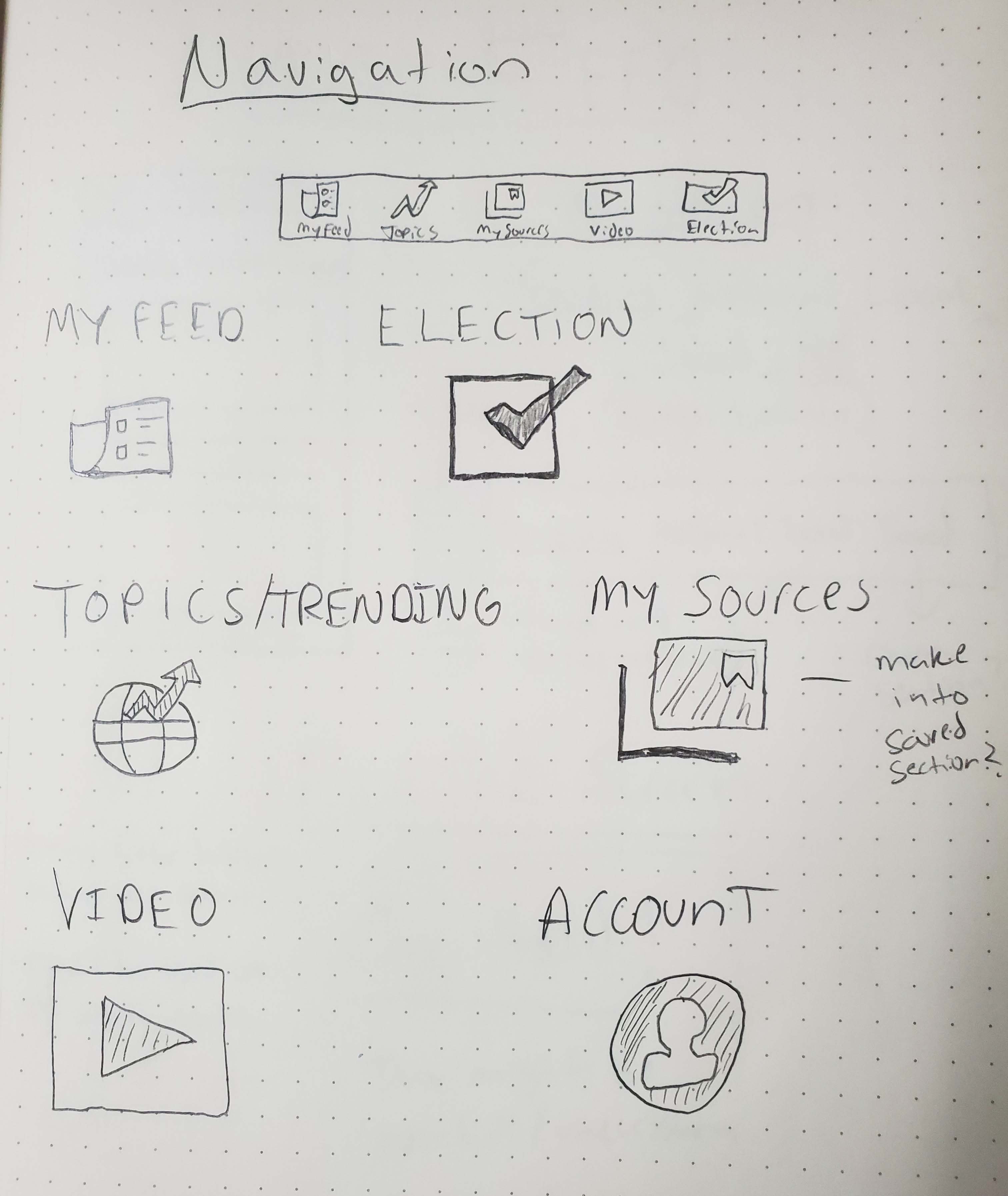
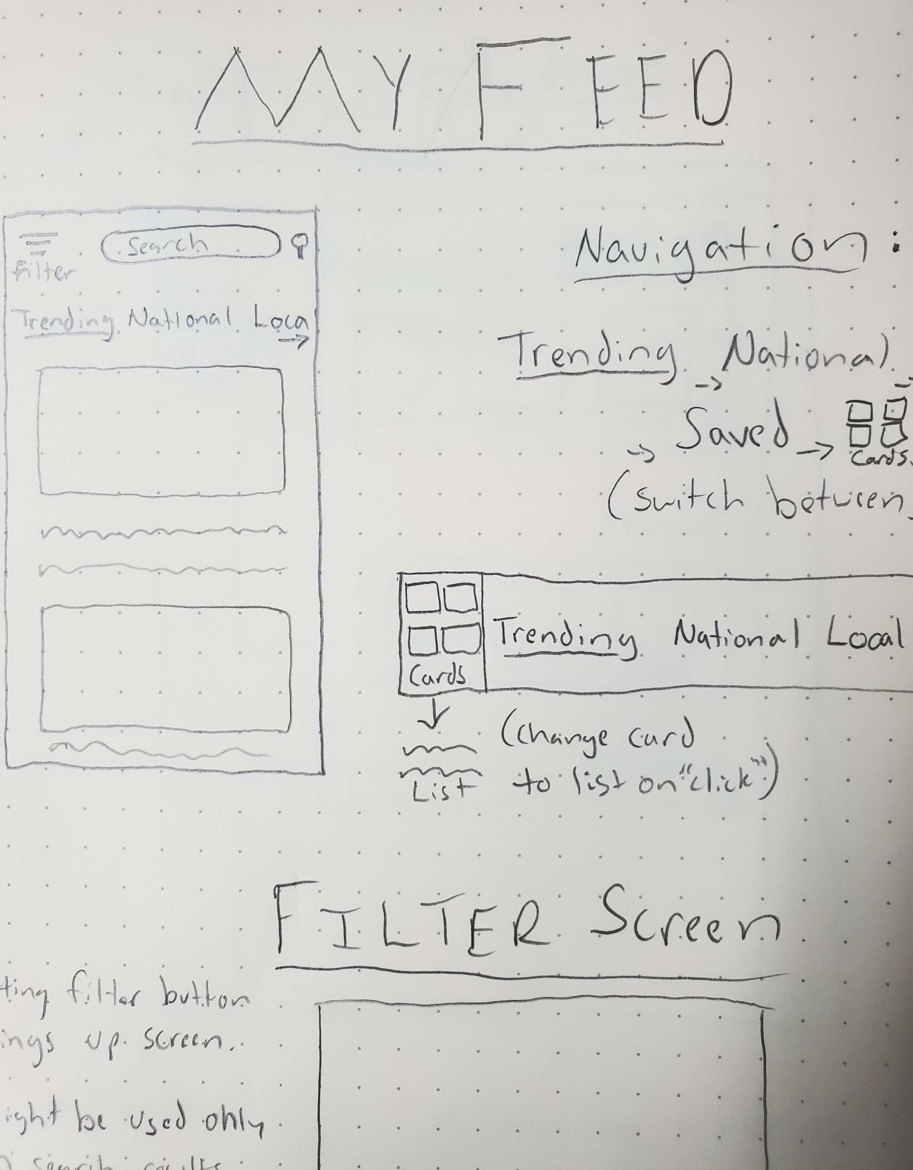
Using pen and paper we were able to work through designs in the early stages and iterate until we felt comfortable with each section of the app and how it addressed the problems we encountered. Most of the design was built off of the model that Google News uses and some features we designed ourselves.

Some ideas, like a store for candidate merchandise, testing user knowledge on articles they read, and voter registration needed to be abandoned due to the complexity it imposed on the design or infeasibility.

navigation wireframe Navigation
my feed wireframe My Feed
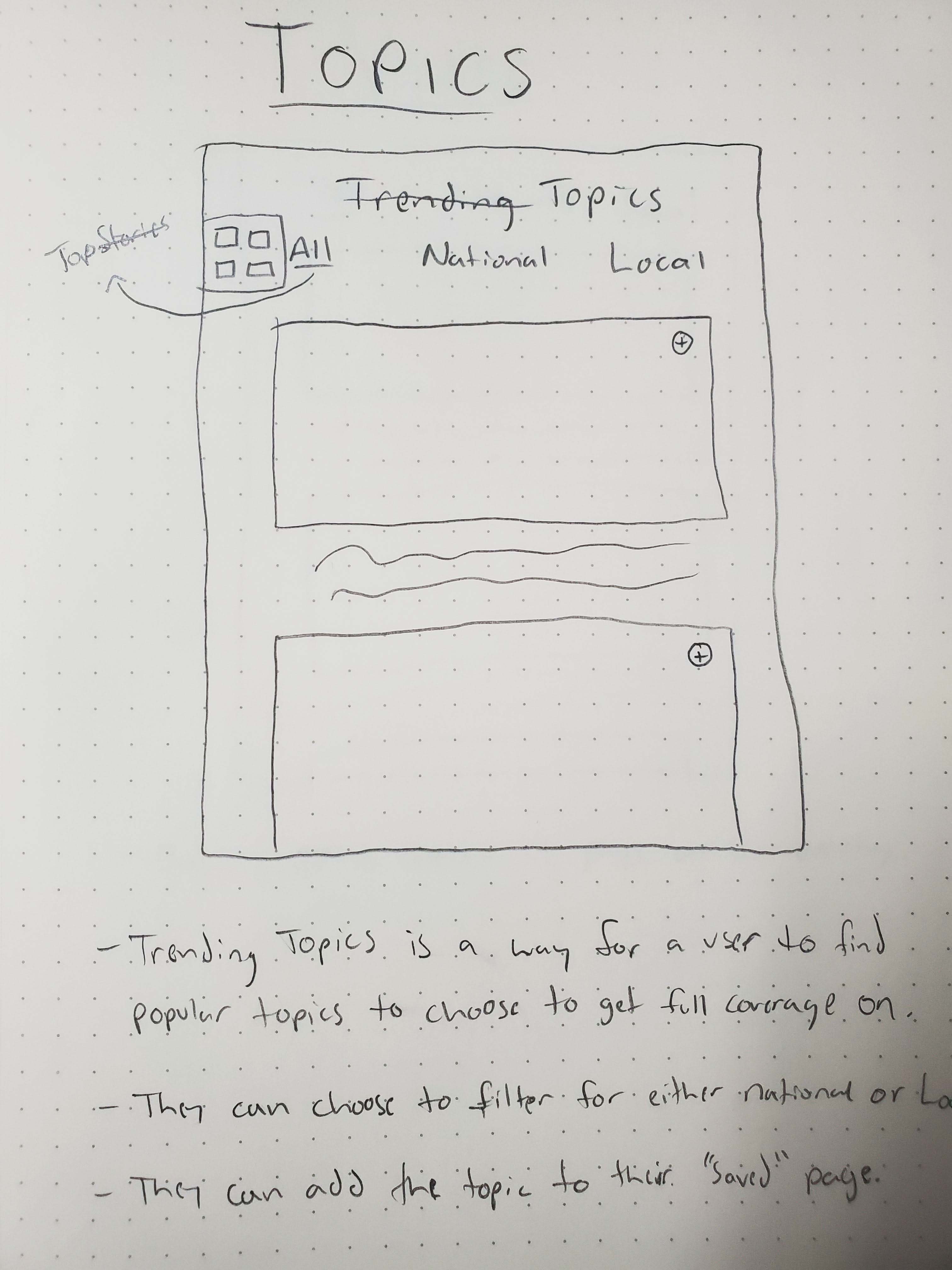
topics wireframe Topics
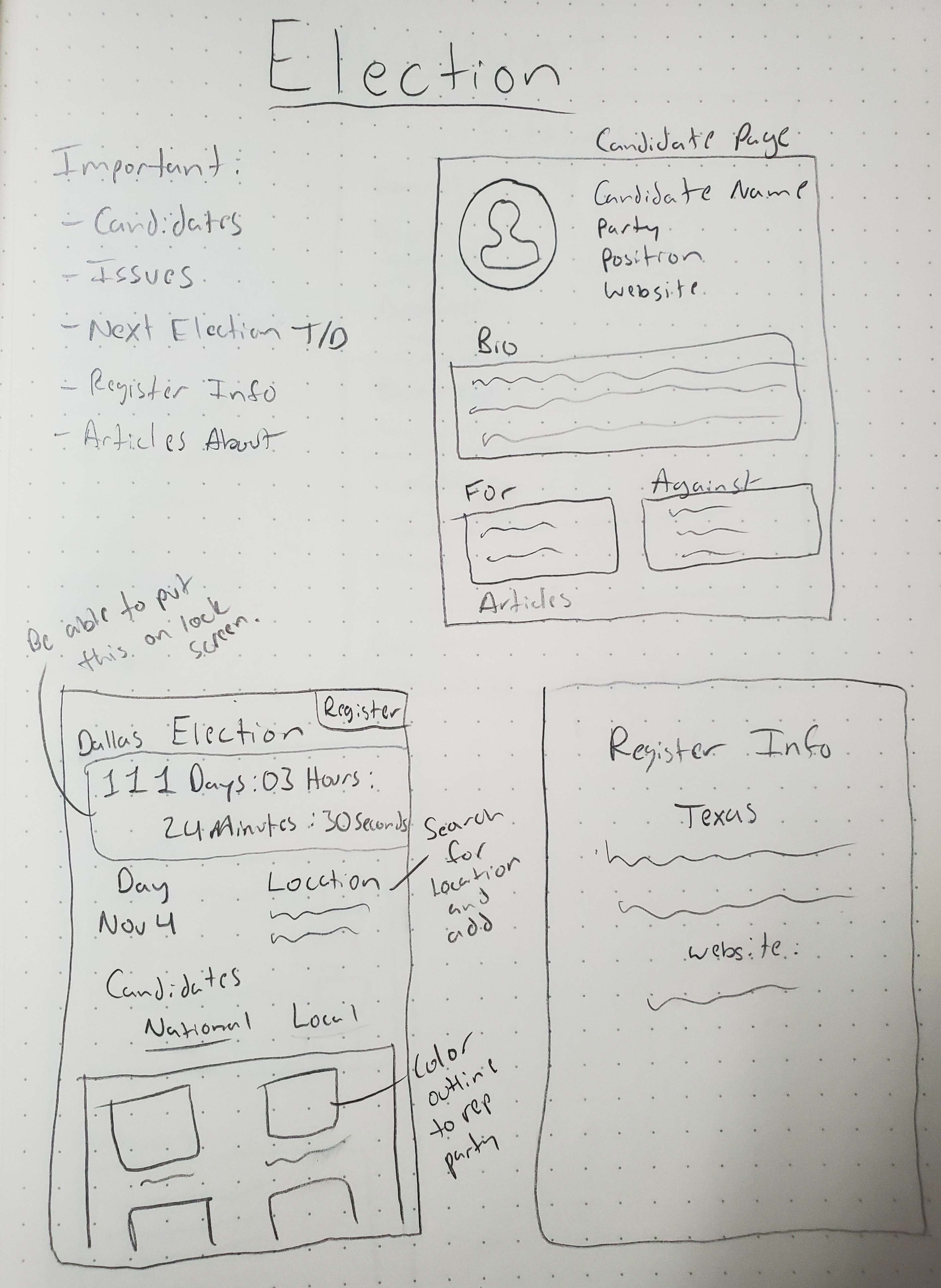
elections wireframe Elections
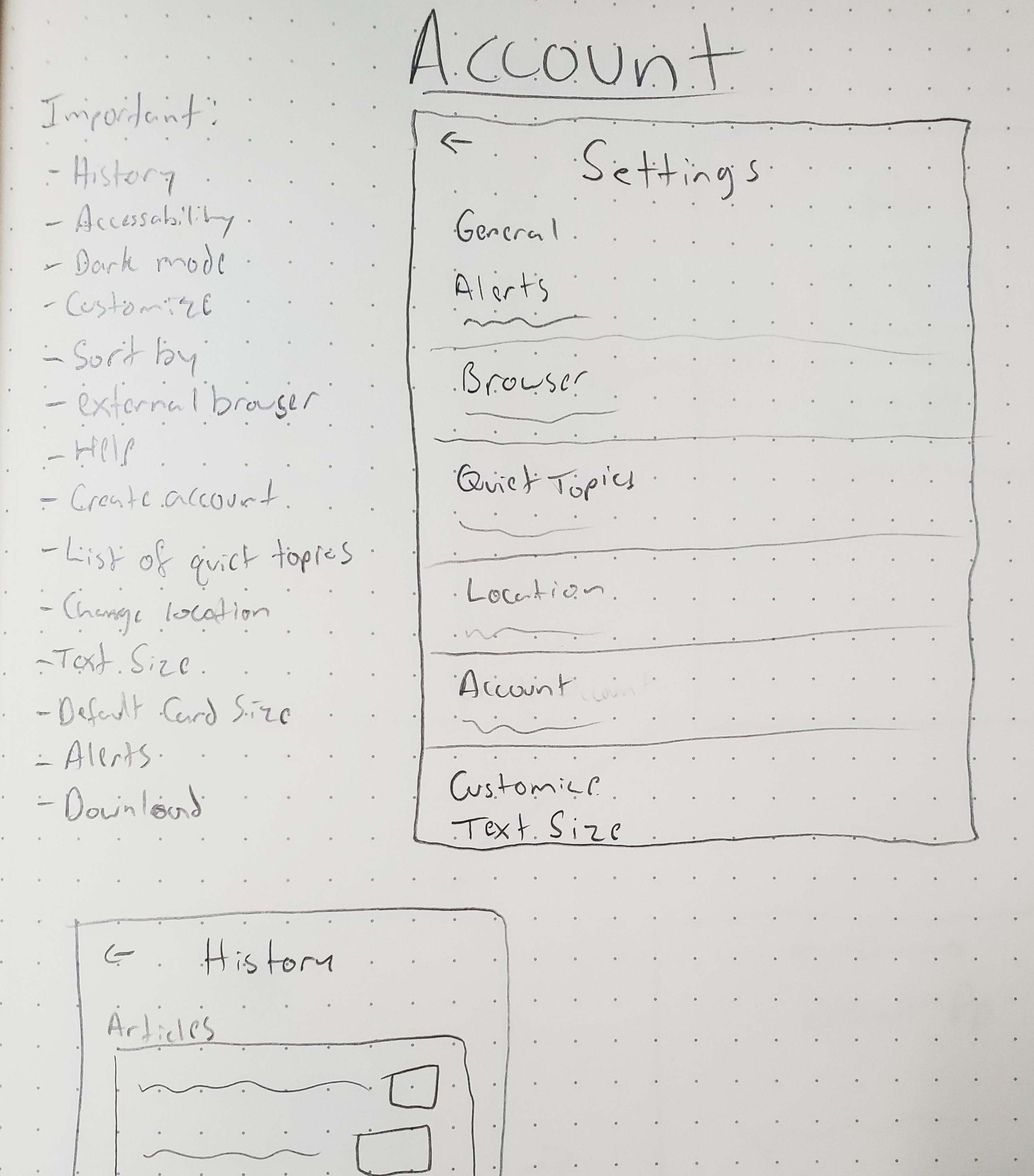
account wireframe Account
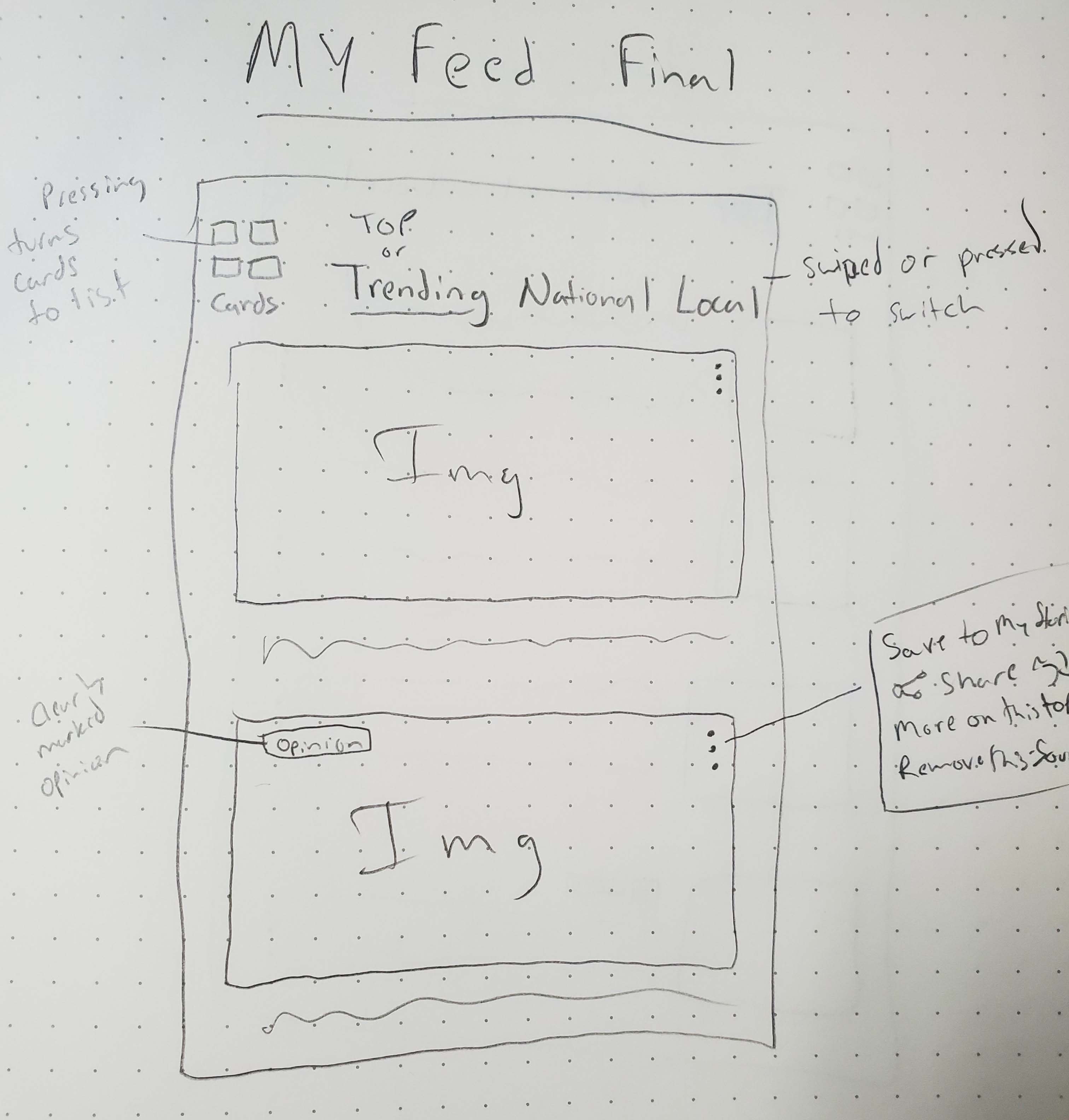
final my feed wireframe My Feed 2

Final Result

After several iterations of wireframes we were able to use Figma to create a mockup of the different screens of the app. Sketching the wireframes helped us to finalize which screens were important and what features should be included in them. We also created some branding materials using Illustrator, like logos and an app icon.

The most important problems we wanted to address, aside from sources, were the importance of local political news, helping users become politically well-rounded, and marrying political news and elections.

My News

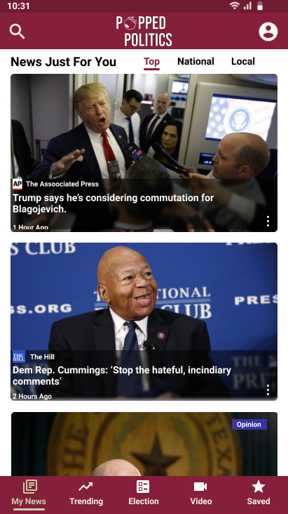
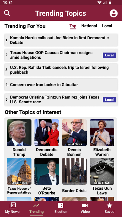
The screen for "My News" emphasizes the importance of local news by letting the user separate the feed from combined top-news, national, and local news. Global news in general was not included, unless related to U.S. politics, as the focus was on U.S. politics.

More Coverage

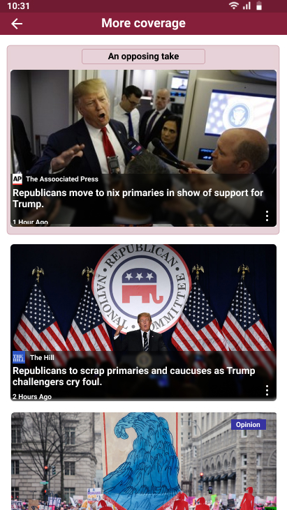
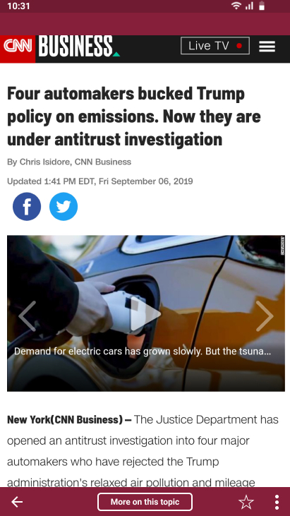
Taking direction from Google News we adopted a full-topic coverage screen that a user could access while reading an article on a topic that they wanted to know more about. We expanded on it by using information about the previous articles source to nudge them to a source opposite the x-axis on the "Media Bias Chart," by highlighting it on the coverage screen. This helps the user find a different perspective on the topic of interest.

Election

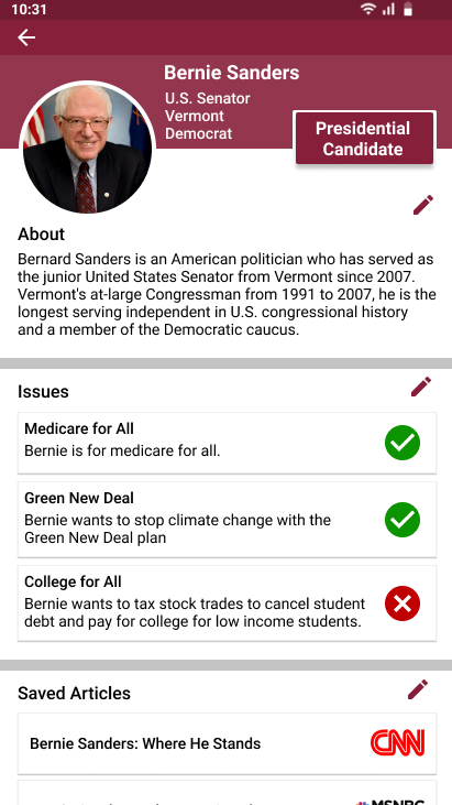
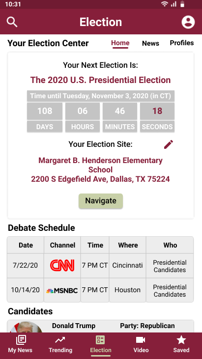
To help users connect their political news to national and local elections, we created a section on the app dedicated to this. Users will have the ability to see election-specific news, create profiles of candidates, and see important election information.

My News Popped Politics my news mockup
Popped Politics my news mockup
More Coverage Popped Politics more coverage mockup
Popped Politics more coverage mockup
Election Profile Popped Politics election profile mockup
Popped Politics election profile mockup
Election Center Popped Politics election center mockup
Popped Politics election center mockup

All Screens

final prototype onboarding screen
final prototype home screen
final prototype schedules screen

Reflections

The process for designing this app showed me how much research really should inform design and that no matter how much you believe in your design at times you may need to take a step back, set aside your ego, and ask if you are really solving the problem. In the beginning I included features that were intended to get revenue streams from candidates, like a point based system that users could use to buy candidate's campaign merchandise. I also looked into a way for users to register to vote. These ideas were either too complicated or were being implemented way too soon in the design process.

The target audience for this app was for younger people, and mainly the 18-44 demographic, but I now wonder if that's the audience that would benefit from the design most. In my research I saw that people over 50 were 7 times more likely to share fake news than younger people. Maybe in order to solve the problem we should pivot to focus on an older target audience? Would they even be interested? These are questions I would research further given more time.

Go to Dallas ePay Go to Netflix