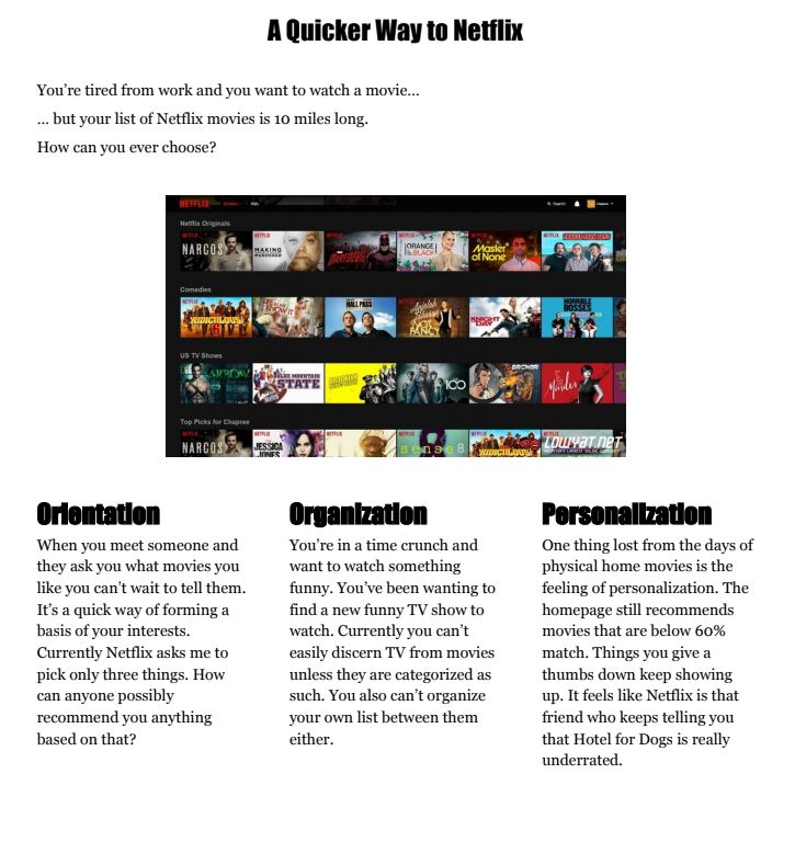
E logo

Netflix (Fall 2017)

Stop searching and start watching.

Netflix Final Prototype

Overview

  • As a design exercise I chose to evaluate Netflix's web and mobile platform to see if certain key aspects of the design could be improved upon.
  • Using user interviews, company research, competitor analysis, and heuristic evaluation, I was able to identify some key design problems and areas for improvement.
  • I used pen and paper, Adobe Photoshop, and Figma to design a prototype that incorporated my potential solutions and presented them.

Goals

  • Decrease the time it takes for users to find movies or TV shows to watch.
  • Increase customer engagement and user data.

Responsibilities

  • Research
  • User Interviews
  • Wireframing
  • Prototyping
  • Presenter
netflix teardown

Research

I began by doing research to figure out how to improve upon a well established design by Netflix.

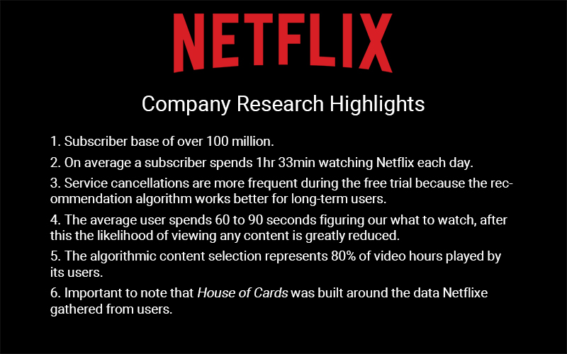
My research entailed company research, user interviews, heuristic evaluation, and I also read blogs and message boards for customer insights.

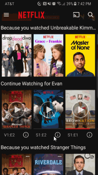
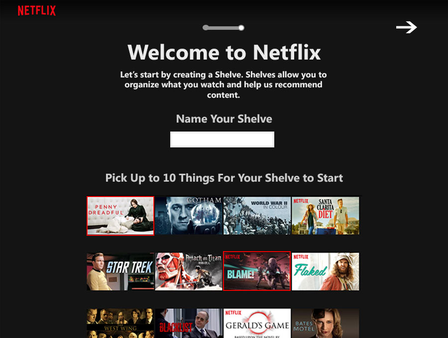
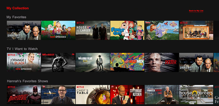
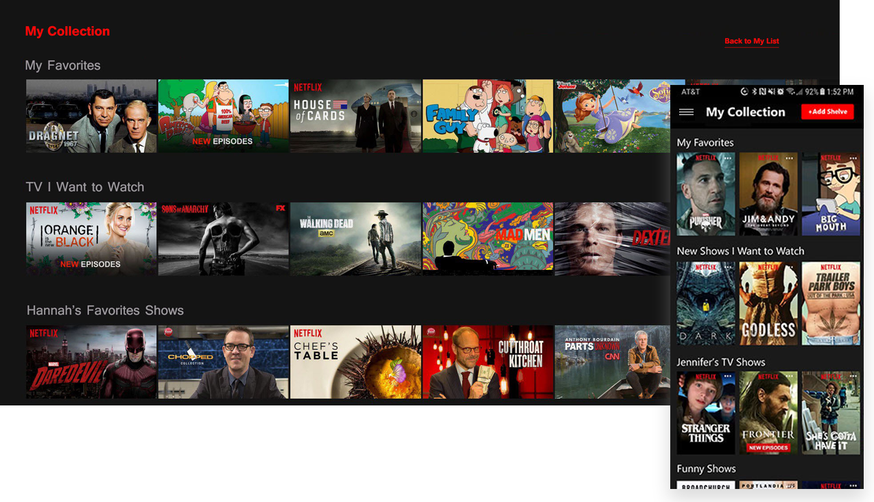
This research informed me that users wanted more control over how they organize their shows and movies. Users also voiced their frustrations over Netflix's algorithm and ever-changing home screen. For Netflix I found that data was "king" and needed to be taken into account before any design decision was made. I used this to put a "wish list" of features together.

netflix research

The Problem

After taking all of my research into account I decided to focus on the organizational aspect of Netflix.

The average user spends the first 60 to 90 seconds deciding what to watch and after that the likelihood of viewing any content is greatly reduced. What if we could give the user more control over the organization of their TV shows and movies based on their moods, time, or favorite genres?

Wireframes

Sketching possible solutions was a really fun and interesting experience. I looked at other applications, such as Spotify, for inspiration. I also took in to account user's mental models of how they organize their entertainment, especially movies, and how my own family cataloged our VHS tapes and DVDs back in the day when adding a playlist-like function.

After getting feedback on my designs I was to iterate them until I was happy enough to move to a high-fidelity prototype.

my collection wireframe My Collection
schedules wireframe Scheduling
mobile card wireframe Mobile Cards
onboarding wireframe Onboarding 1
onboarding wireframe Onboarding 2
onboarding wireframe Onboarding 3

Final Prototype

Building off of my wireframes I created an extensive high-fidelity prototype using Photoshop and Figma. I used Photoshop because I wasn't totally redesigning the interface, only adding features, and this allowed me to take images from Netflix and add those features. Figma for making the prototype interactive.

I created features like "My Collection" and "Shelves" - similar to playlists - which would allow users to organize and separate their handpicked content from the homepage. I also created an "Add a Schedule" page which would allow admin users to limit how much they or other users can watch (this would be helpful for parents trying to limit how much their children watch).

final protoype GIF
final protoype GIF
final prototype onboarding screen
final prototype home screen
final prototype schedules screen

Reflections

I learned a lot on this redesign about the design process. The research I did about Netflix was extremely valuable to the insights I gained about how to design for this company and its users. I wish I had more time to further research and user test, which could help with further iterations, but I believe with the resources and time that I had the final product came together really nice.

When I presented it to my instructor and peers I received some valuable feedback, like having a "time bucket" instead of strict schedules, that if I were to continue with this design I would be able to incorporate in further iterations.

About a year later Netflix did a redesign and added some of this functionality. Now they have separate pages for movies and TV that allows the user to see their "My List" separated.

Go to Popped Politics Go to Gmail